Making a New York Times map
Of the many things the New York Times does well, their way of explaining the news through maps such as these is one of the best. The maps are always informative and enlightening, and often have an artistic element as well.
Their graphics team’s ability to quickly develop such detailed maps has always made me wonder how they’re able to do it. So I set out to recreate one of their maps, and make it in a reproducible way that allows for rapid development on future projects.
This guide will cover how to find the raw map data sources, use command line tools to process the data and display it all in a web browser using D3.js. An optional final step will go over using Adobe Illustrator to clean it up.
The code and files used for the map are available in this Gist, so you can skip past any parts that you aren’t yet familiar with.
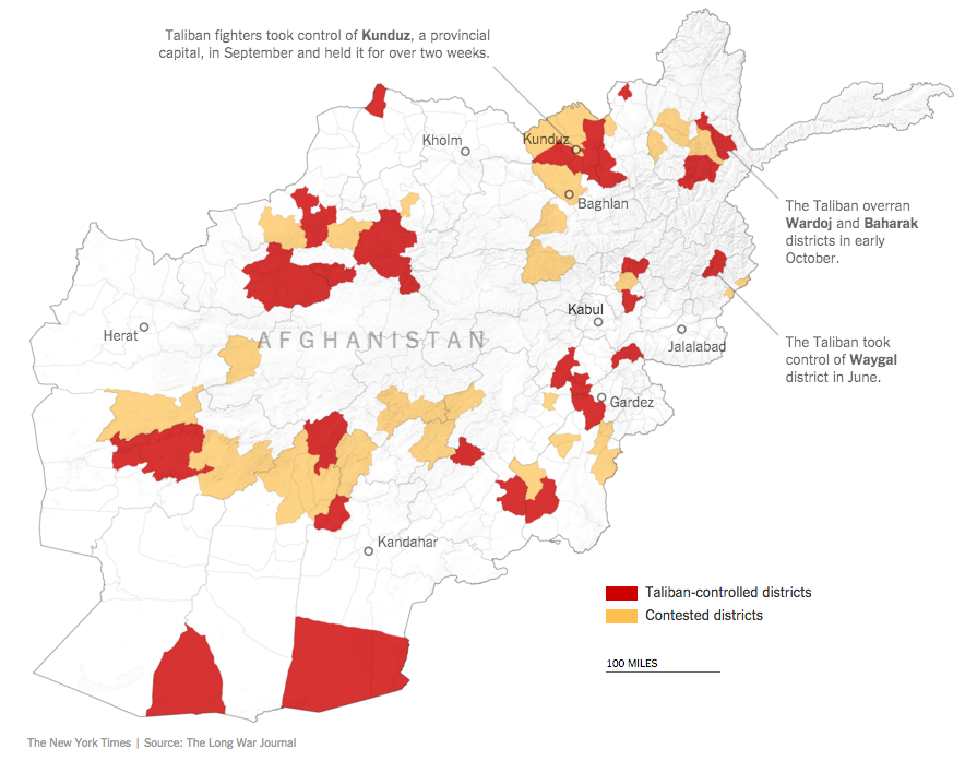
For this exercise, we’ll focus on this map of Afghanistan. Once we’re finished, you will have this map to show for your work.
Setup
Assuming you’re working on a Mac, you’ll want to start by installing Homebrew. This is a software package manager that helps you install programs and keep them organized. A lot of other programs are available through Homebrew, so you’ll probably use it again on future projects.
Open your Terminal app and run the following:
/usr/bin/ruby -e "$(curl -fsSL https://raw.githubusercontent.com/Homebrew/install/master/install)"You’ll then want to use Homebrew to install GDAL (for geographic data processing), ImageMagick (for image processing) and Node.
brew install gdal imagemagick nodeInstall TopoJSON (for working with map files) via npm, a Node package manager.
npm install -g topojsonThat’s it for writing code directly to the terminal. The rest of the code is stored in files that are then called on from the command line.
Getting the data
The New York Times’ map displays Afghanistan’s cities and districts. You might not be able to tell immediately, but it also shows provinces with slightly darker borders. The provinces consist of districts, similar to how states are made up of counties. We only need to get the districts in order to have both geographic regions.
We can download district map files from Princeton University’s Empirical Studies of Conflict Project.
For the cities, we can use a file found on Natural Earth. This site is often useful for international and national-level geographic files. The file includes cities around the globe, but we will filter it down to only those in Afghanistan in the next step.
You might also notice the subtle terrain texture shown most-prominently in the northeast corner of the map. You can clearly see the underlying image here.
This is called shaded relief. While not necessary in order to create this map, it’s a nice addition that reveals the topography of the region.
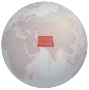
The tiles covering Afghanistan.
The shaded relief imagery we will use is from NASA’s Shuttle Radar Topography Mission. Derek Watkins has made a tool called the SRTM Tile Grabber that makes it easy to determine which topographic map tiles we need. These files are fairly large, but you’ll be able to delete the intermediate files after the image processing is finished.
Vector data vs. raster data
Now that we have geographic boundaries and cities (lines and dots on a map) and satellite imagery, we have all the data we need. These two types of map data are referred to as “vector” data and “raster” data, respectively.
Vector data can be zoomed in on as much as you’d like without any loss of accuracy or image integrity, while a raster image cannot. Think of the difference between when you pinch and zoom on a smartphone. Text usually scales up and remains crisp, while photos often become pixelated.
Compare this vector image (SVG) to this raster image (PNG) to see the difference. The SVG file stays crisp and the PNG file becomes pixelated. We will have to be aware of this limitation while working with the topographic images.
Using Make
The full process of downloading, converting and exporting both types of data is scripted in a Makefile. This means the entire process is repeatable and can be run with a single command, such as make all.
Make is structured so you define how each file’s creation depends on other files. Here is the format:
target_file: prequisite_file
    @# Code to create target_file.
In the example below, running make File_B.json would first run touch File_A.shp because File_B.json requires that File_A.shp exist. Once File_A.shp is created, Make would then run cp File_A.shp File_B.json to create File_B.json.
File_A.shp:
    @# File_A.shp is the target file.
    @# It has no prequisite files.
    @touch File_A.shp
File_B.json: File_A.shp
    @# File_B.json is the target file.
    @# File_A.shp is a prequisite file.
    @cp File_A.shp File_B.json
All of the programming in a Makefile is for the command line. This project uses standard bash commands and the command-line interfaces for GDAL, TopoJSON and ImageMagick, but you can always call on files written in other languages, such as Python, Ruby or JavaScript. This would be perfectly valid for a Makefile:
target.shp:
    @python script_to_create_target.py
Make is helpful for two big reasons, the first of which is that it clearly documents how you’ve created new files and how they depend on each other. When you revisit this project in the future, you will be able to clearly see how you created the output files. You can then quickly edit a step in the process and rerun the command.
The other main reason for using Make is because it monitors the modification time for each of your files, which results in you spending less time waiting around for your output files. If you’ve already run make all, and then run make all again, it won’t trigger any processes because Make knows that there is nothing new to create. The file dependencies have not changed. If you delete or alter a file, only then would make all run some or all of your processes once again.
If you aren’t using Make or a similar program for documenting your data conversion, now is a good time to start.
Scripting downloads
Here is how you can download a .zip file using bash’s curl command.
mkdir -p zip
curl \
    -o zip/ne_10m_populated_places.zip \
    "http://naciscdn.org/naturalearth/10m/cultural/ne_10m_populated_places.zip"
And here is how you can unzip that file.
mkdir -p shp
rm -rf tmp && mkdir tmp
unzip \
    -d tmp \
    zip/ne_10m_populated_places.zip
cp tmp/* shp
Converting data
Vector data
The outline for converting and exporting the vector data is to filter out any unnecessary information (e.g. cities outside of Afghanistan), convert to a different file format for use by a web browser and simplify the map to reduce the file size.
To remove extraneous information, we will exclude small cities and those outside of Afghanistan. The SCALERANK field ranks cities based on their size, so we only include those that have a rank of 7 or higher. This will reduce the file size and therefore speed up load times in your browser.
This uses GDAL’s ogr2ogr command, which allows you to manipulate geographic files. See Derek Watkins’ GDAL cheat sheet for a long list of other commands that you might find useful. We will also use GDAL commands for manipulating raster images in the next section.
ogr2ogr \
    -f "ESRI Shapefile" \
    shp/cities.shp \
    shp/ne_10m_populated_places.shp \
    -dialect sqlite \
    -sql "SELECT Geometry, NAME \
        FROM 'ne_10m_populated_places' \
        WHERE ADM0NAME = 'Afghanistan' AND \
              SCALERANK <= 7"
Convert that new Shapefile to GeoJSON, which is an open-source format usable by D3 and most other mapping programs.
mkdir -p geojson
ogr2ogr \
    -f "GeoJSON" \
    geojson/afghanistan-cities.json \
    shp/cities.shp
Convert GeoJSON to TopoJSON. This reduces the file size even more while maintaining its accuracy. The TopoJSON format is also usable by D3 (both of which were created by Mike Bostock).
mkdir -p topojson
topojson \
    --no-quantization \
    --properties \
    -o topojson/afghanistan-districts-fullsize.json \
    -- geojson/afghanistan-districts.json
For the district and province TopoJSON files, you’ll want to simplify the geometry in order to reduce the file size. The -s flag determines the degree of simplification, while the -q flag determines the degree of quantization. The two are different, though similar in that they can both reduce the complexity of the map and therefore reduce the file size.
The number 1e-9 is shorthand for scientific notation (1 x 10⁻⁹), both of which are equivalent to 0.000000001. Similarly, 1e4 is short for 1 x 10⁴, or 10,000.
topojson \
    --spherical \
    --properties \
    -s 1e-9 \
    -q 1e4 \
    -o afghanistan-districts.json \
    -- topojson/afghanistan-districts-fullsize.json
Raster data
The plan for the raster data is to merge the individual downloaded files into one large tile, convert the new image into the correct map projection, crop the image to the outline of Afghanistan’s border, perform some color correction and hillshading techniques, and then convert to a smaller PNG file for use by a web browser.
Merge topographic tiles into a single file. The smaller tiles were downloaded in the same way as the cities ZIP file.
# Makefile code to loop over tiles and merge into single TIF file.
tif/afghanistan-merged-90m.tif: \
    tif/srtm_48_07.tif \
    tif/srtm_49_07.tif \
    tif/srtm_50_07.tif \
    tif/srtm_51_07.tif \
    tif/srtm_52_07.tif \
    tif/srtm_48_06.tif \
    tif/srtm_49_06.tif \
    tif/srtm_50_06.tif \
    tif/srtm_51_06.tif \
    tif/srtm_52_06.tif \
    tif/srtm_48_05.tif \
    tif/srtm_49_05.tif \
    tif/srtm_50_05.tif \
    tif/srtm_51_05.tif \
    tif/srtm_52_05.tif

    @mkdir -p $(dir $@)
    @gdal_merge.py \
        -o $@ \
        -init "255" \
        tif/srtm_*.tif
Convert the TIF file to the Mercator projection (EPSG:3857) for use by D3. It comes in the WGS 84 (EPSG:4326) projection.
gdalwarp \
    -co "TFW=YES" \
    -s_srs "EPSG:4326" \
    -t_srs "EPSG:3857" \
    tif/afghanistan-merged-90m.tif \
    tif/afghanistan-reprojected.tif
Crop the image to the outline of Afghanistan. We’ll use one of the vector files from earlier to define the country’s outline.
gdalwarp \
    -cutline shp/district398.shp \
    -crop_to_cutline \
    -dstalpha \
    tif/afghanistan-reprojected.tif \
    tif/afghanistan-cropped.tif
Shade and color the image to arrive at the final TIF file. This post on Stack Exchange is helpful for understanding the options available when creating hillshade images.
rm -rf tmp && mkdir -p tmp
gdaldem \
    hillshade \
    tif/afghanistan-cropped.tif \
    tmp/hillshade.tmp.tif \
    -z 5 \
    -az 315 \
    -alt 60 \
    -compute_edges
gdal_calc.py \
    -A tmp/hillshade.tmp.tif \
    --outfile=tif/afghanistan-color-crop.tif \
    --calc="255*(A>220) + A*(A<=220)"
gdal_calc.py \
    -A tmp/hillshade.tmp.tif \
    --outfile=tmp/opacity_crop.tmp.tif \
    --calc="1*(A>220) + (256-A)*(A<=220)"
Convert the TIF file to a PNG file and resize it in order to reduce the file size.
convert \
    -resize x670 \
    tif/afghanistan-color-crop.tif \
    afghanistan.png
Displaying map on a web page
At this point, you are finished processing data. You now have all of the files you’ll need for the map. You can see them all on this Gist page. Now it is time to display those results on a web page.
During development, you’ll want to load your HTML pages through a local server. Open your terminal and navigate to your project directory, then run the following to create a server at port 8888.
python -m SimpleHTTPServer 8888
# Press CONTROL + C when finished.
Open your web browser and go to http://localhost:8888 to see your page.
I won’t go over the basics of making maps in D3 and instead only focus on the unique parts of this project. If you’re completely new to making maps with D3, try following some of Mike Bostock’s tutorials to get started. This guide is a good starting point. I have other maps on bl.ocks.org that might help too, such as this one focusing on labels and this other map that explains how to calculate a distance scale.
Syncing raster images with vector outlines
An important part of this map is making sure that the raster imagery is scaled at the same level as the vector data, and that they are aligned on the page. This post by Mike Bostock helps explain one approach.
// Define map dimensions.
var map_width = 850;
var map_height = 750;

// Create a unit projection.
var map_projection = d3.geo.mercator()
    .scale(1)
    .translate([0, 0]);
var map_path = d3.geo.path()
    .projection(map_projection);
Now that we have an unscaled projection, we will use our page’s parameters to create a scale. This will determine the relationship between the map’s actual dimensions (e.g. 5 decimal degrees) and its displayed dimensions (e.g. 500 pixels).
d3.json("districts.json", function(error, districts) {
  if (error) return console.warn(error);

  var bounds = map_path.bounds(topojson.feature(
    districts, districts.objects["afghanistan-districts"]));

  // Calculate the pixels per map-path-degree.
  var scale = 1 / Math.max(
    (bounds[1][0] - bounds[0][0]) / map_width,
    (bounds[1][1] - bounds[0][1]) / map_height);

  // Find how to translate map into view based on the calculated scale.
  var translation = [
    (map_width - scale * (bounds[1][0] + bounds[0][0])) / 2,
    (map_height - scale * (bounds[1][1] + bounds[0][1])) / 2];

  // Scale and center vector using new scale and translation.
  map_projection
    .scale(scale)
    .translate(translation);
});
This same scale will then be used to scale the raster image. By using the same scale, we can be sure that the vector and raster data will align.
// In d3.json function

// Scale and position shaded relief raster image.
// This assumes it has been cropped to the vector outline shape.
var raster_width = (bounds[1][0] - bounds[0][0]) * scale;
var raster_height = (bounds[1][1] - bounds[0][1]) * scale;

var rtranslate_x = (map_width - raster_width) / 2;
var rtranslate_y = (map_height - raster_height) / 2;

// Shaded relief
svg.append("image")
    .attr("id", "Raster")
    .attr("clip-path", "url(#afghanistan_clip)")
    .attr("xlink:href", "afghanistan.png")
    .attr("class", "raster")
    .attr("width", raster_width)
    .attr("height", raster_height)
    .attr("transform",
          "translate(" + rtranslate_x + ", " + rtranslate_y + ")");
The rest of the D3 code places city markers, writes city labels, draws label lines and colors certain districts.
You might notice little differences between our map and the New York Times map, but this get us pretty close. For an optional final step, use Adobe Illustrator to clean things up.
Adobe Illustrator and ai2html

For additional fine-tuning, it is easiest to use Adobe Illustrator for working with vector graphics. The New York Times has a helpful open-source project called ai2html that makes it easy to export Illustrator files into HTML and PNG files, including different sizes and styels for different devices (phones, tablets, laptops, large monitors).
This is how the New York Times appears to have created the presentation for their Afghanistan map. You can tell because, whereas our map creates an SVG graphic in the browser, their map is simply a static PNG image with HTML laid on top.
This Gist shows how we can take the SVG made with D3 and convert it to static HTML and PNG files, like how the New York Times map was done.
Install SVG Crowbar (yet another New York Times project) so you can save our SVG as a local file. Follow ai2html’s installation instructions and then open your SVG file in Illustrator. You can find my final Illustrator file here.
You’ll probably find that some elements are miscolored or aligned wrong, but you can fix that in Illustrator. Some of the text labels in D3 were hacked together to imitate a cohesive text block. Fix that by combining the text into a single entity.
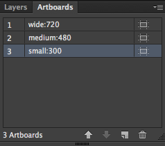
The different artboards.
Copy the artboard for each width that you’d like to create, possibly one for small, medium and large. Name them according to the format large:min_width, such as large:480.
Size the artboard and its contents according to the minimum width desired. Make sure the responsiveness field is set in your settings block, either as responsiveness: fixed or responsiveness: dynamic. Fixed makes it a little bit easier to predict how your graphics will be displayed at different screen sizes.
In D3, we added all of the content that will be needed for the largest width. We will remove some elements for smaller widths so the map won’t be so crowded.
For smaller artboards, be aware that font sizes will need to be increased. Text will wrap between breakpoints if dynamic, so you’ll also want to allow for extra padding.
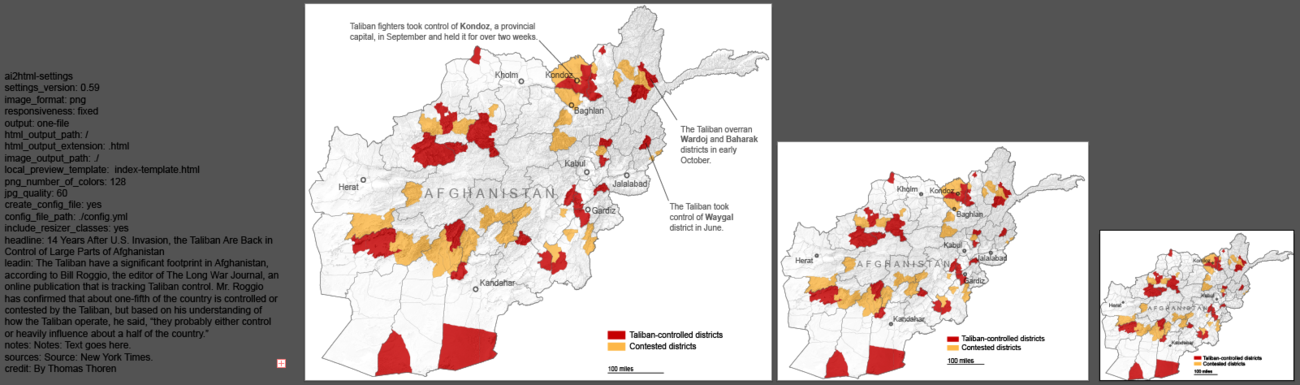
The different artboards with the settings text block to the left. Notice how the smaller artboards include fewer labels and cities.
Here is a sample config text block:
ai2html-settings
settings_version: 0.59
image_format: png
responsiveness: fixed
output: one-file
html_output_path: /
html_output_extension: .html
image_output_path: ./
local_preview_template: index-template.html
png_number_of_colors: 128
jpg_quality: 60
create_config_file: yes
config_file_path: ./config.yml
include_resizer_classes: yes
headline: 14 Years After U.S. Invasion, the Taliban Are Back in Control of Large Parts of Afghanistan
leadin: The Taliban have a significant footprint in Afghanistan, according to Bill Roggio, the editor of The Long War Journal, an online publication that is tracking Taliban control. Mr. Roggio has confirmed that about one-fifth of the country is controlled or contested by the Taliban, but based on his understanding of how the Taliban operate, he said, “they probably either control or heavily influence about a half of the country.”
notes: Here is some note text.
sources: Source: New York Times.
credit: By Thomas Thoren
job_title: Open data reporter
Export the artboards using ai2html by running File > Scripts > ai2html in Illustrator. This will output HTML and PNG files’. Load index.preview.html in your browser to see the results.
You’ll need to add either the resizer-script.js block into the preview HTML page or have the file in the same directory so you can import it. This file makes your page readjust according to the page width size.
Make sure breakpoints are working by adjusting the width of your page. You should see the elements scale up and down, and disappear and reappear. Edit the HTML file to include any font styles that may have been lost in the export step, such as bold and italics. Also add in any font styles for your text, if you’d like.
That’s it! I hope you were able to learn a lot and will be able to apply this information to your future projects. Please let me know if you found this useful and show me what you went on to create.